My level design process

Yesterday another big milestone was reached: with the completion of the last level to play in, all the playable content in the game is now done! Now my efforts will be in overall polish and finally making the menu graphics. However, I also thought it might be interesting to open up my level design process a bit here.
Overall planning
Something I chose right from the start for my level design was quality over quantity. The choice was, I could either do small building blocks to make multiple levels for a set of themes, or hand craft more carefully made levels with their own unique gameplay elements. The latter felt more correct for the game, as the rounds can last over 5 minutes and the game doesn't feature complex movement features for the characters, like wall jumps.
This also worked better for my theming. I did not plan ahead when I started making the game what the levels should thematically be, but when I started the level design process it became clear quite quickly. I wanted the locations to not just be random "cool" places, but rather tie them to the game's world and feel connected to each other. I also added small descriptions for each level, to add more story to the game and place the levels into the game world.
From the idea...
When starting to design a single level, of course there first had to be the idea. The goal was for each level to have its unique gameplay gimmick, to keep the experience of playing fresh for a long time. This is most of the time where I started from: I simply thought what would be fun mechanically. Moving platforms, lightning striking from the sky, gusts of wind every now and then lifting players to the air. I'd start making these gameplay functions before any visuals to make sure they felt fun and doable before jumping into figuring out the visual identity of the level. This would also include what is the placement of platforms, as it is influenced a lot by the mechanic in question.
For some levels, the visual identity was the first thought, however. As I made the unlocking system for all the spells, it made sense that you would unlock water type spells from a water level of some sort, so then of course I would need to design a water level. Then the task would just be figuring out the correct mechanic to fit such a level first. Often for these mechanics I reused the assets from the spells the players use in one way or another.

...to the visual identy
After the mechanic was designed, I moved on to the visuals. I made some quick sketches in Clip studio for most of them, but I didn't linger too long on the sketching process. I had fairly clear ideas for each level's look after the ideas and the simple style of the game doesn't require too much planning. I also found it great to "sketch" inside the game engine itself and tried to get to that phase as quick as possible. Import some blocks of the graphics there, move them around, change their colors. Then sometimes I might've grabbed a screenshot of this in-engine mockup to sketch more on top of it.
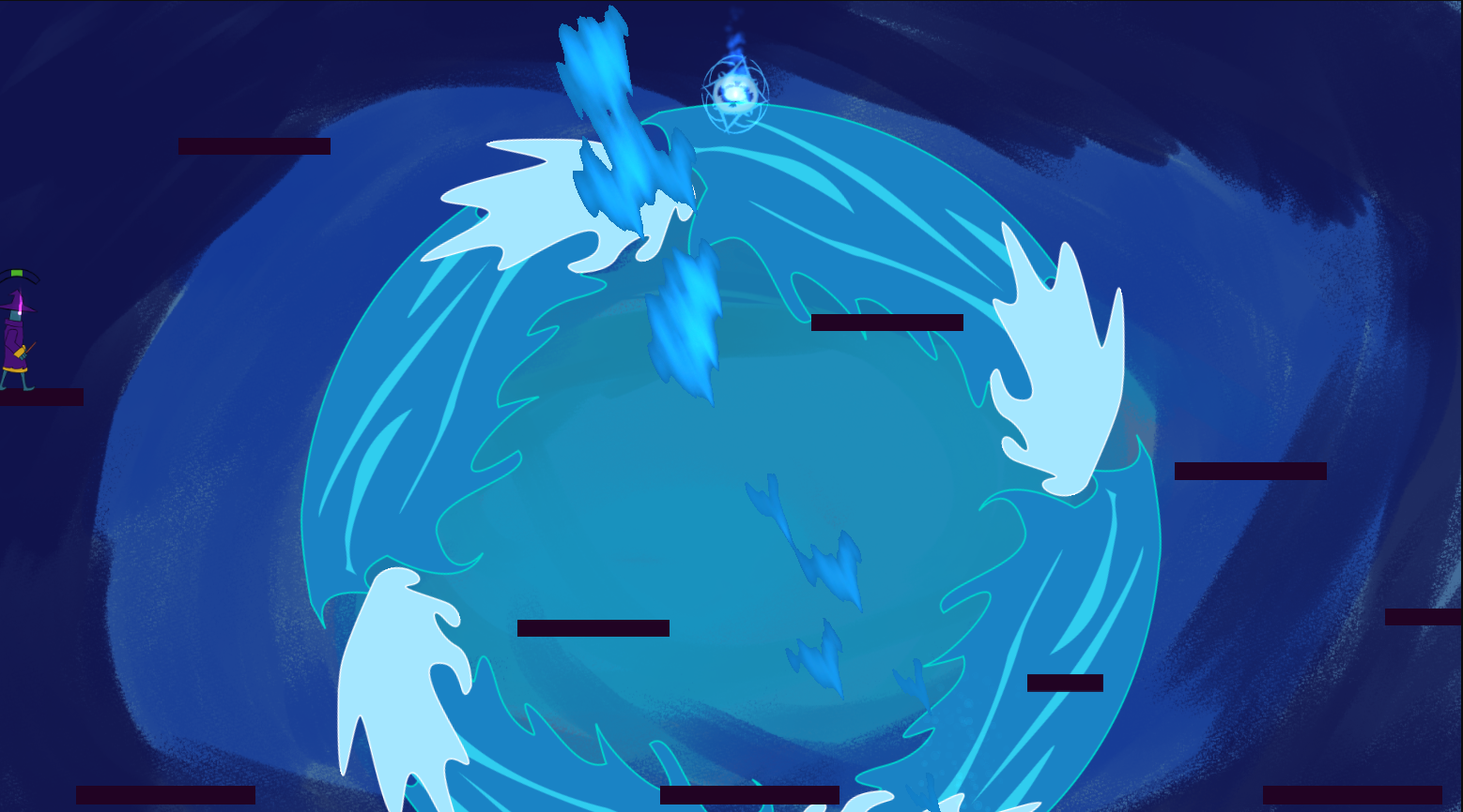
After I knew what I needed for the level, I'd do the graphics either in Inkscape, Clip studio paint or Krita, depending on what I needed to achieve. Most of them are vector images from Inkscape, but for example the tutorial map required complex patterning on the background and I felt it would come out faster and more naturally if I simply painted it.

Rest of the process is a lot of adjusting and going back and forth from engine to art program. I'd constantly import things to the engine even when they were not complete, just to get a better view of how exactly they would look in the engine and interact with any possible movement they would have. Being able to change the colors in Construct 3 with a simple effect was a godsend, and almost every level includes some of these adjustments.
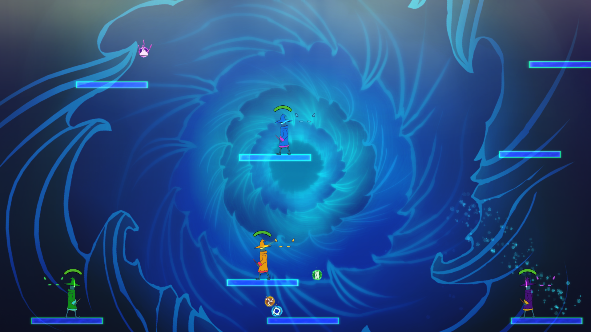
The last part of the process was adding some VFX and effects to make things really feel lively. Cloudy peak has twinkling stars and a shooting star going by every now and then. The Ocean tunnel has small bubbles inside the waves, and sunlight pierces through the top of the level through the water. In the Magic Forest, the leaves of the trees react to explosions and the wind moves the hanging chimes periodically!
Final thoughts
That is more or less the progress each level of Battle wizards went through. To be honest, I was not quite as excited about designing the levels initially as I was about doing the core gameplay designing the spells. However, making the levels turned out to be both more fun and faster than I expected. I'd finish most of them in just two days, and feel like I managed to make each quite unique from each other. My biggest concern with the levels is that I got better at making them towards the end so the early levels don't look quite as good as the last ones!
With 10 levels and the tutorial, I feel the game is at a good spot. I could definitely make more, but at some point you just have to say this is enough. Now to look forward to getting to test the newest levels with other players!
Get Battle Wizards
Battle Wizards
Collect powerful spells and unleash their powers against your friends in this chaotic, up to 4 player platform fighter.
| Status | In development |
| Author | Aldenwar |
| Genre | Fighting |
| Tags | 2D, Controller, Fantasy, Local multiplayer, party-game, Wizards |
| Languages | English |
| Accessibility | Interactive tutorial |
More posts
- Battle Wizards is now free!Aug 16, 2021
- The game is out!Aug 05, 2020
- The last stepsJul 21, 2020
- Origins of Battle WizardsJun 11, 2020

Leave a comment
Log in with itch.io to leave a comment.